Final photos – Evaluation

After planning my photos, I got my equipment together and went and took my photos. I made sure to stick to my plan as closely as possible but I did change a few things where I felt it would work better. Here are my final photos and how I feel they turned out:


Final photo 1.jpg

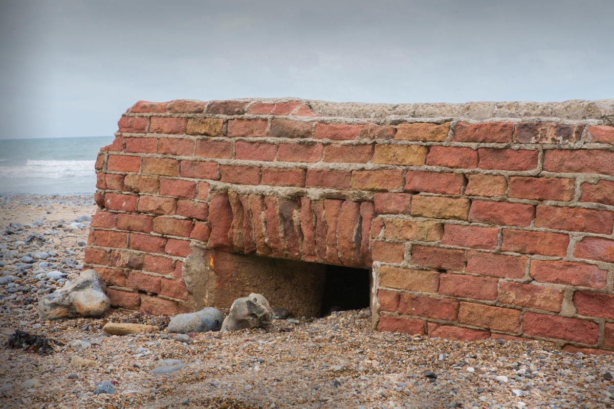
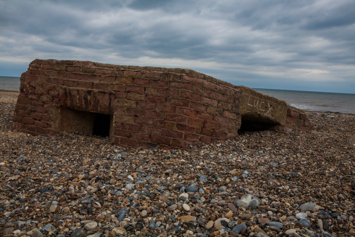
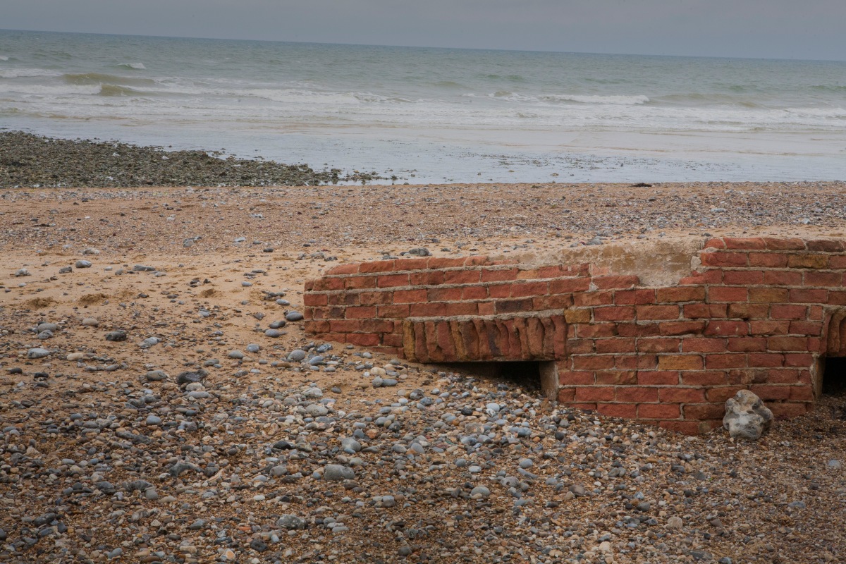
For my first photo, I took a close up of one of the visible windows and a corner of the building. I felt this showed how much the building is vanishing into the floor/sand and how battered the bricks are too. This building has been through a lot and this really is shown on the corner bricks as they have been rounded off due to the sea passing over it every day. The bricks are no longer set shapes but are more uneven and jagged. The sand is flowing in through the window and filling the building up meaning that the building is inaccessible. In editing I made the outside darker due to Schreck’s work but I kept the building light and unedited as I like that side of Feijen’s work as it means you appreciate the natural look of the building. I did take them on an over cast day which helped get a bright look to the photos and also meant that the sky was completely grey. I like how your eye gets lead to the window and how dark and gloomy it is in there.


Final photo 2.jpg

For my second photo, I tried to concentrate on the slant of the building and how much the building is falling into the sand. I also took it on the side with the door to show how there is no way in and to also show that you wouldn’t possibly know that that is the door way due to how covered up it is. I took the photo from a little away so I could include the beach going into the distance on the left and to have the sea on the right. This shows the surrounds and how out of place the building is. The slant of the building is facing the sea due to the backwash from the waves when it’s high tide. I like how this photo gives you a feel for how much this building is vanishing under the floor and will soon be completely gone.


Final photo 3.jpg

For the third photo I wanted to show the same as the last photo but show more of the sea to make the viewer feel the threat of it and to understand the power of it and what it can do to a building. The picture also shows a window which is pretty much completely covered and part of another window which is like Schreck’s work where he only showed part of the second bed as it makes you feel like it could go on for ever. You can also see parts of the building where the bricks have come away due to it being battered by the sea. This building isn’t just disappearing; it’s also falling apart. I like this photo due to the feeling of helplessness that the sea makes the viewer feel towards the building.


Final photo 4.jpg

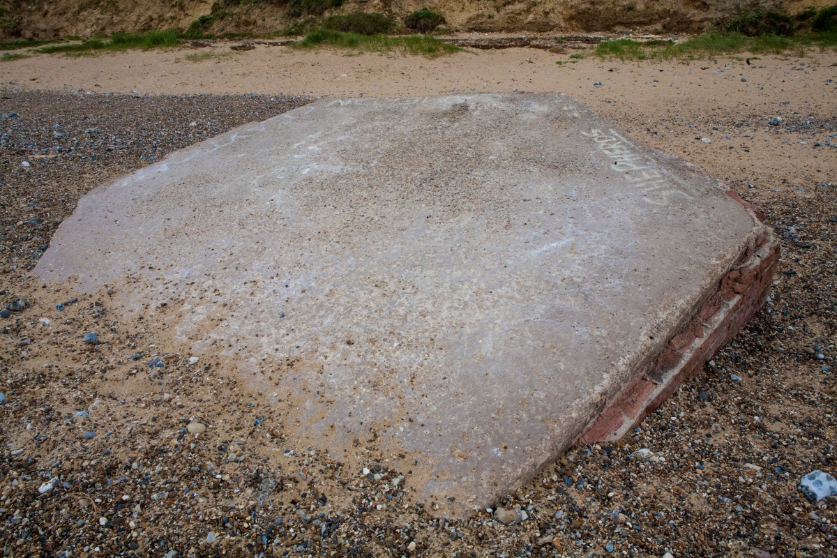
For my fourth photo, I wanted to show the roof of the building being eaten by the floor. The way the sand is creeping up the roof shows the feeling that this building is being swallowed up by the floor/sand and every day it will be more gone and this is actually true as from the time I took my test shots to the point I took my final shoots I couldn’t take a photo through one window and out of the opposite window. It was only a little bit over a week between each shoots and there was already a massive difference in the amount of coverage. I like this photo as it gives a personality to the sand and makes it seem scary.


Final photo 5.jpg

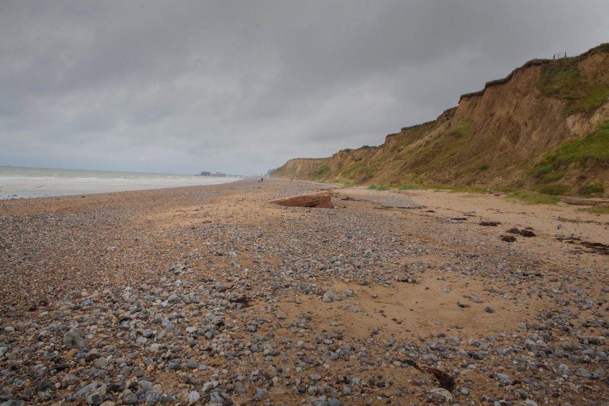
For my fifth photo, I took a faraway shot of the building to show how unimportant it is on the beach and how it could easily be walked past and not noticed. The beach is so big and vast that the building just isn’t noticed easily and can be walked past. For this photo I included a lot of sky and darkened it to make the photo darker and scary. I would have liked it more if the clouds would have had more texture just like in my test shots as it gives more emotion to the location.


Final photo 6.jpg

For my last photo I took a closer photo from the same angle as the last but the purpose of this is to show how the importance of the building is stolen due to the pier being more important to most holiday guests and anyone on the beach due to the building not being fun or an activity which can be done. This means that the building is not important anymore and this photo really shows why. I also feel having all the people in the background helps prove my point as it shows that they are all walking towards the pier and are not interested in the building. I like how this photo came out and really helps show the viewers that this building doesn’t matter anymore.


Overall I feel that these photos show how buried and forgotten this building has become. The building went from being something that looked after our country to protect us from oncoming enemy boats to an unloved pile of bricks. This is also shown due to it once being on the top of the cliff and now being on the beach demonstrating its importance falling just like it did. I do feel that the clouds could have looked a bit more moody and had more shading but I’m overall happy with the way it shows the story of this building and it’s life on the beach.

Final photos – Planning

After researching different artists work and doing test shots this gave me enough time to experiment and find out enough information on what I want to do for my final photos. After looking at the different styles and using them in my own work, I found that the dark editing but not giving the photos a creepy feel worked best for my final location. After doing all my research I finally decided that I was going to take my final photos at the beach building in Norfolk. I’ve come to this conclusion due to the story behind the building and how forgotten it has become. I also feel that the way it completely vanishes when the tide comes in is crazy and more interesting than the other places I came up with. The thought that at least once a day the building cannot be accessed or seen from land makes the building distinctive as not many things get covered by the sea and stay complete. The building is also inaccessible due to it being mostly under the sand and full of pebbles too. The building is also at a slant due to the sea pulling it under on one side just like pebbles being pulled into the sea due to the backwash.

For my photos I would like to keep the focus on the building so I’m going to do this by trying to take close up photos but I also want to give a size representation and show how insignificant it is compared to everything else around it. I would also like to take them when the sea is pretty far out as I don’t want there to be any danger of getting stuck or splashed when taking the photos. I would also like to take them with natural bright light but not necessarily a sunny day. I like the idea of taking them on a stormy day or even just on an overcast day to give the photos a moody feel.

I would overall like to make the viewer see the beauty of this building once again and to give time to think about its history. I also want people to be intrigued by this photo and to want to find out the history of other places and to open their eyes to see things that they wouldn’t normally look at. I want to make people love the history of places again and to make people consider the story of run down locations.

Second test shots and evaluation

After looking more into my options for locations to take my second test shots I decided that the building on the beach fitted my specification the best as it had so much history and was so helpful but now is sinking into the sand and not being noticed at all by people walking by. I couldn’t take photos from inside the building as it’s full of sand so I mainly focused on the outside and the sand surrounding it. I took the photos at midday whilst the sun was out just like my other test shots as to not add any unnatural shadows or lighting. Here are my test shots and my thoughts on how they turned out.


Second test shot 1.jpg

For my first photo, I took a photo of the building from a side profile and from a low angle meaning you are viewing the building close to the floor so that you can see how much this building is disappearing into the sand. I also really tried to include the clouds as they give a moody feel to the photo due to the way I edited the photo. I edited the photo to make it darker and to give more definition to the clouds. I feel this works like pathetic fallacy as the clouds show that the weather is bad which gives the viewers a negative feeling towards the location. The weather is being shown as bad meaning they are more likely to be scared. I chose to include both the window and the door as it truly shows how covered up this building is and that there is no way you could enter this building. I like the outcome of this photo and think the mood created is perfect for the scary and moody feel I was wanting.


Second test shot 2.jpg

For my second photo, I took a photo of the building from far off as to show the size of it and to give a representation of how it could easily be missed. It isn’t the most important thing either and this is shown by having the pier in the background. I did this to show that when you are walking down the beach you are more likely to look at the pier than the building that’s disappearing into the sand as you go to the beach to have fun and the pier is a key part of holiday life. From this view you can see that one side of the building is completely under the sand and can hardly be seen from the sea edge. This once very important building used to view oncoming ships and protect our country is now forgotten and will one day not exist due to sand continuing to cover it. I feel this photo works really well as it shows how unimportant the building is and how small it seems compared to the beach. I also made this photo darker and created the moody clouds for the same feeling as my last photo.


Second test shot 3.jpg

For my third photo I took a picture through the small gap that is left at the top of the door where it is just possible to see through to the other window. The room left inside the building is very small and not possible to get into. I felt that this photo would be good to make the viewer feel claustrophobic and to see there isn’t much chance of this being cleaned out and used again. I focused on the insides and the rubbish that had been places into the building and I like how you can see how much the building is falling to the right due to the way the sand is consuming it. It also makes me think about how when the tide is up this building is submerged and the insides will be completely underwater. This means that at points in a day the building is completely gone and can’t be seen. I think that the tight feeling of this photo works really well and I would like to include a photo like this into one of my final photos.


Second test shot 4.jpg

For my last photo, I focused on just the roof of the building and the section where the sand takes over and starts to consume the building. I like how it seems that its sucking it under like water and that the sand is creeping up it just like something being submerged in a bath before it sinks. I kept this photo a bit lighter than the others as it doesn’t include clouds so I tried making the viewers feel a negative feeling from just the thought that the building is sinking. It’s as if the sand is quick sand and the building has no hope to get out. I kept the rest of the building out of the photo as I wanted the focus to all be on the intersect of sand and roof. I do feel this photo works but would have worked better if it included a darker surrounding and scary weather.


Overall I feel these photos turned out super well and gave the impression of something being forgotten and unloved. I feel this is just like Feijen’s photo of the bus being taken over by undergrowth and never to be used again. I think that the dark setting which I was inspired by Schreck’s photos, works really well with the building on the beach and I would like to use this for my final photos. I feel that doing all this research and figuring out the right setting and editing style has made me know what I want and understand what I’m going to do for my final project.

A sense of place – Test shot ideas 2

Having just finished my first set of test shots where I looked at dilapidated buildings, I decided I would now move on to take pictures of places that are more forgotten than dilapidated. What I mean by this is taking photos of places that are in locations that make them very easy to see, but people often just don’t look at them or think about the importance that they would have had in the past. This will hopefully allow me to show the story of these places to help bring them back to life.

Similarly, to Feijen’s second image of the bus which has been overgrown, I want my locations to be in plain sight but be overgrown by greenery or taken over in some other way, such as covered over by water or by sand on a beach for example. This would most likely mean that the location is often overlooked, and although it may once have been important, it is now forgotten to the point that people walking by it take no notice of it even being there anymore. Within these test shots, I will once again use both Schreck and Feijen’s styles of gloomy and scary as well as natural and unedited to see which I like the best.

The first location that I am considering taking my second test shots, is a beach building located on the beach between East Runton and Cromer in Norfolk. This is a small building that was once used as a lookout for the army, but has now fallen from the cliff and is sinking into the sand to the point where people may not even notice it’s there anymore. This building is now so far into the sand that you can no longer access it, and only a small part is visible from the sand. The thing that I thought was unique about this location is that none of the other chosen locations has been covered by sand. I haven’t really seen any images like this before, so I thought it would put a unique spin on the forgotten and dilapidated place images.

My second location idea for this theme is an old and potentially no longer used graveyard. This would be overgrown by greenery and forgotten to the point that you may no longer be able to access it easily, despite the fact that it was once used regularly to visit people that had unfortunately been lost. It would be very unique to take images of a forgotten location like this because very special days would have once been made there due to funerals, and finding a forgotten location like this would show that a lot of time has passed and even those that are buried can even be forgotten.

My third location idea is a block of houses that has been closed off within Northampton that is near to Vue and the antique shop that has the elephant on the roof. This building got blocked off by fences due to them becoming too run down and dangerous for the people to continue living there in a safe environment. These buildings are once again in plain sight as they are on a normal road, however, people often overlook them and don’t think about them existing at all. The unique thing about this location is that people may have lived in these buildings not so long ago, and, similarly to the last theme, there may still be belongings and furniture within the building that was left by the people that used to live there. This would give the place a sense of being forgotten and abandoned, giving it its own unique story.

My fourth and final location idea for this theme is old boats that have been abandoned at harbours or potentially in old boating salvage yards. I like this idea because nobody would be paying attention to these any more but they would be more unique than any of the other images I have seen, due to their unique story of being out at sea and once being used to make money and provide people with jobs. Due to the way they have aged, people will once again most likely not think about the story that these boats have had and the many years of time that they will have spent at sea, making them another forgotten location. There may also be some fishing gear still on these boats, enhancing their story more and giving more depth to the images.

First test shots and evaluation

After researching the different locations that I could take my first test shots I came to the conclusion that taking them at the old farm building would work the best. I felt the other locations wouldn’t have worked as well and also I didn’t hear back from anyone I contacted to see if I could take photos in these locations meaning I could only use the farm building. For my test shots I took them at midday when the sun was out so that I could get natural but strong lighting. I tried to focus on the outside of the building due to it potentially being dangerous and also to capture the state of the surrounds too. Here are my test shots and my thoughts of how they turned out.


First test shot 1.jpg

For my first photo, I took a shot of the side of the barn with the main focus being the smashed window hiding in the undergrowth. I wanted to include the undergrowth in this photo to show how overgrown and unused this building is and that it’s hard to even see that there is a property on this land. In editing I tried to make it more like Schreck’s work by darkening the corners and creating a scary feel to the location. I even attempted to give the photo an older feel by lowering the saturation to lose most of the high pigmentation from the plants. I feel that this photo turned out how I was expecting and gives the spooky feeling to the viewers. I do think it’s sad that the inside isn’t visible as I felt this was the most important part of the photos I researched and told most of the story. I do think that maybe it’s a little too dark and could do with one area that is brighter as to make the eye travel across the photo.


First test shot 2.jpg

For my second photo, I took a close up of the window and the inside of the farm building. I wanted this to be more about the inside and the details in the smashed glass. For this photo I tried to use Feijen’s style and make it unedited and natural. I felt that the way the bushes were creeping in from the sides gave the feeling that it’s being attacked and will soon be completely gone. I also think that the way the sun is shining on the contents of the barn makes it seem inviting which is completely opposite to the feeling the last photo made you have. I left this photo a lot lighter and the saturation up which helps make the bushes look healthier and the location look sunny. I do think I prefer my first editing style though.


First test shot 3.jpg

For my third photo, I took a shot from either side of the barn wall through an empty window. This means you can see inside the barns and the contents and also a passage way which runs down the side of the barn to a door which is sat out in the wildlife with no purpose.  I made this photo slightly darker than it naturally was but left the outside area more light towards the end of the ‘tunnel’ as this shows possibly an open space at the end of it. I made the inside darker to give a spookier and more dangerous feel to the remnants of the barn and what’s been left behind. I like how this photo shows both inside and outside the barn and the different feelings they create.


First test shot 4

For my last photo I took a photo of the sign which was on the wall of the barn which tells you to stay out of the building due to the danger of being electrocuted which is scary and unexpected as it’s not being used anymore but also is why I didn’t enter the building in the first case. I tried to make this photo unsaturated and dark as to make it seem spooky and to tell a story of the location. I feel this wasn’t one of the best photos as it doesn’t have any of the building in it meaning there isn’t much to look at.


Overall, I feel these photos were successful and out of the two different styles I liked the spooky and dark photo as it makes the viewers have a fear for this location and know it’s a dangerous place. I do want to try a different location for my next test shots but I feel the style will be the same. I want to look more into things being swallowed by their surroundings just like this barn with the trees looming over it and making it difficult to see it.

Sense of Place – research

For my concluding assignment I’ve been tasked to take photographs in a location that has significance and character. I’m first beginning my journey by exploring others work and gathering tips and tricks which I feel useful, and which I feel will impact my own images.

Ben Schreck

One of the first photographers work that I have found is Ben Schreck. He takes a variety of different images of various things, but one of his sets of images that really caught my eye was ‘Lost Places’ within the Urban Exploration section of his website, which you can see here: http://www.explorerviews.de/lost-places/. The reason I chose this photographer as my first inspiration is due to the way he captures images of buildings which are ruined and decaying, but still seem to have their own beauty about them. This is due to the way Schreck sees and captures the unique look of each place.

Nick Schreck

Here is one of the photos that stood out to me the most out of Schreck’s ‘Lost Places’ collection, which is called ‘Urbex Acedia’. I found the lighting mysterious and slightly foggy, giving the viewer an insight into how dusty and old the room is. Another thing I like about this photograph is that the furniture from when the building was still inhabited, still exists in the room and remains untouched, making it seem as if the building was just abandoned and forgotten about a long time ago. The window is smashed and the walls are grimy and cracked, making the building seem treacherous and uninhabitable.

When Schreck took this photograph, he would have used only natural light, as you can see that all of the shadows in the image are casted from the light coming through the window of the room. This helps the dilapidated room feel more untouched as the light would fall in the same way if you were in the room in person. I feel that Schreck chose to have the chair as the main focus of the image as it can lead the viewer to feel that, although the chair was used in the past, it was just abandoned in a hurry, making the viewer intrigued as to what may have caused the abandonment to happen in the first place. The last physical thing that Schreck has done in this photo is only including half of the bed on the right within it. This makes the viewer feel as if the room could go on, and there could be many more beds within the same room.

When editing the image, Schreck seems to have lowered the saturation of the image. I think this as the image seems black and white at first, but looking closer you can see some of the paler colours such as on the bedside cupboard and the window frame. This makes the room look older, as old things seem to fade and lose all of their significant colour, becoming dull and grey. Another way that Schreck has made this photograph look old is by putting a dark gradient on the edges, as old photos can fade this way over time, and it makes the room feel darker as a whole.

Overall, I feel that this image ‘Urbex Acedia’ has made me understand that it’s important to tell a places story through the way the photo is taken and edited. Instead of having to explain a story through words, you should make the viewer feel the way that you want them to through the way the photo is taken and the editing the photo is put through. This could simply be what the main focus is, or it could be something as simple as where the light is coming from within the photo.

Niki Feijen

The second person that caught my eye was photographer, Niki Feijen who also takes photos of dilapidated buildings and appreciating that they still have beauty just like Schreck’s work. This section of her work is called Urbex which means Urban Exploration, as her work revolves around places that tell the story of something that used to be grand but now is in a state of no repair. She uses her photos to tell the story of the buildings and what they went through to get to this state. You can see her work on her website at: http://www.nikifeijen.com/gallery.  I chose Feijen as my inspiration due to the way she captures buildings that have a lot of history and lets others enjoy the remnants of them before they are fully gone. This means that she finds herself in very dangerous areas, potentially risking her life in order to take these photos for others to then enjoy.

Screen Shot 2017-07-12 at 17.10.14

Here is one of Feijen’s photos that stood out to me the most due to the polar opposites of the beautiful furniture and the dilapidated building. This specific photograph is called Quake, due to the condition of the building being caused by an earthquake that did so much damage to the castle that it was even too dangerous to go back and retrieve the furniture. Within her description of the image, she even says that the castle is “A pretty dangerous place to move around as it could collapse any second”. You can find this quote on her online gallery (linked above) under image number 71. In the photo you can see a room with expensive sofas which have been abandoned due to a large hole in the wall and the floor which has appeared due to the power of the earth moving. The walls are brightly coloured but are covered in cracks that multiply as they move along.

To me it seems as if Feijen has taken the photo without flash as to keep it natural and not to adapt the environment with her presence. The light is all natural and streaming in through the large holes that cover the buildings walls and also telling us that it’s open to the elements making it more dangerous due to rain rotting the supports. The image doesn’t look highly edited and looks natural and bright. She might have used a reflector to bounce the existing light around the room better and light up any possible dark spots.

Overall I feel the natural style that Feijen uses is very easy to look at and pleasing to the eye. I like that when you look at the photos that it’s how you’d see it if you were there and it’s not highly edited to make you feel scared so you can just enjoy the buildings for what they are. I also like how she picked up on the bright colours and made the hole to all the different rooms the main focus as it shows more than the story of the one room that we are in. I would like to try and use these methods in my own photos.
I also really like this photo by Feijen called ‘Jungle Bus’ as it’s a similar style but it shows something that could soon be gone and has been forgotten about. In the photo, you see an old bus being covered by undergrowth and the door is the only thing possible to see. I really like the idea of something that would have been used every day is now vanishing into the wild and never to be used again. I would really like to use this idea in my own photos as it’s showing love to something that is forgotten and soon will be gone forever. Just like the vegetation in Feijen’s photo but instead sand as it always gets blown over items and burying them.

Screen Shot 2017-07-12 at 16.47.13.png

Looking at inspiring photos

Here are photos I have found that inspire me and I will consider when developing my final piece. I have shown some of these before when talking about artists that I like and find inspiring but I will be breaking down each photo today and talking in depth about them. I will be discussing why the photographer/artist took the photos/made the art work and the feelings that are shown with the work.

For my first photo I have a drawing that shows a lady falling into water and she’s trying to hold on but she has weights on her feet which have words on them. I found this on Pinterest which sadly means that I can’t find the artist who made it but there are many people passing it around and using it to describe how they feel. The weights are symbolising her stresses and it’s showing that they make her feel that she is drowning. This piece of art was created for people around the age of high school to connect to and feel that people understand how they feel. It is also used to express their feelings to others. This photo links to peoples lives and the social part of life where not everything is easy and you can feel overwhelmed by everything. I like this piece of work as it shows the feeling that stress can make you feel which is exactly what I want my photos to show. I also want to use water to show drowning and the feeling of overwhelming stress just like this drawing does. When taking my actual photos I will take effort to make it noticeable that they aren’t just drowning but it’s meant to symbolise stress just like their work.

98d5bbb0938ac83ca5ed2fd42b8ff876

For my second and third photo I have someone falling into water and the splashes surrounding them. The first one is taken by Bina Winkler and she took it with the purpose to show how she see’s life and that not everything is perfect. About this top photo she said “Hold me, Love me, Drown me” showing that this photo symbolises about love and how when it ends it feels like your falling and drowning. the second photo is taken by Nina Sinitskaya and this is what she says about this photo: “This image is a part of a Merger project that tells a story of people and nature alliance. — What if the feeling of breeze, rain or warmth of sun on our skin is the feeling of embraces natures gives us? What if it tries to embrace us all the time and we simply don’t notice it because we’re too busy with our lives? So, to get our attention nature begins to embrace us harder, with tornadoes and tsunamis, earthquakes and terrible heat. Only after that we, frightened, become silent in her arms, listening to her breathing. What if we listened and felt from the very beginning?” I think both these photos really links to social views and how people can’t always cope with everything that’s happening in their life. Also both these images could be for either gender and age as it links to the feeling of not coping well with life and not being able to look after yourself. I believe that these photos help people feel that others understand and so they know they aren’t alone. Both these photos were taken on location as they are using water which would need to be in a swimming pool or natural water source. I also think they probably used a fast shutter speed like 1000 or 2000 which means that they would also need a good source of lighting as using fast shutter speeds makes photos darker. This could mean that they took the photos on a sunny or bright day. It would have been created by someone falling backwards into water with their arms out. I think they are very effective and the way they have captured the splashes works really well and gives the feeling they are wrapping around her and pulling her down. I want to have this look for my photos and try to show the water wrapping around them as they hit the water. I really think that they show the feeling that stress can make you feel when it’s got too bad to cope with. When I take my photos I will using a fast shutter just like this to capture a similar look.

5101882549_2a7b3d6027merger_embrace-by-nina-sinitskaya-and-grain-pixels

For my fourth photo I have a photo of a girl under water with her hand hands at the surface. I’ve looked all over the place looking for the name of who took this but I haven’t had any luck. I’ve found it in many places such as on tumbler and pinterest with people using it to explain how they feel and to show that they are down and depressed. This really links to life being overwhelming and personal objectives and not being able to meet them and feeling you’ve failed. It could easily be for anyone due to anyone being able to feel overwhelmed in this way. I do think that due to this photo being so popular on pinterest that people must feel that they can really connect to it enough to want to keep spreading it around to other people. Their are bubbles and it’s dark under the water so the girl can’t be seen very well. It gives the feeling that the person is drowning and they are reaching to the top for air but they can’t reach. The hands have been caught moving out of the water which means that they have a layer of water over which is raised above the rest of the water. This was taken on location just like the last two photos as it’s not very easy to have water in a studio. It’s also probably taken with a fast shutter speed to capture the bubbles and the hands reaching out of the water. For the lighting they probably took it on a normal day with no addition lighting so as to keep it natural and then edited it later to make it look darker. I find the technique of this photo really inspiring and I would like to capture a hand reaching for the surface somewhere in my photo to show that the person is struggling to swim. I also like how the darkness of the water with the bubbles makes it a sinister look making you realise that it isn’t a happy photo.

tumblr_n2rc6z2jcp1svq61yo1_500

For my fifth and sixth inspirations I have two photo by Dorothea Lange who took photos of people in the depression-era and people working on farms. I think that she named the photos taken there “Dust bowl”. The second image shows “Florence Owens Thompson, 32, a poverty-stricken migrant mother with three young children, gazes off into the distance. This photograph, commissioned by the FSA, came to symbolise the Great Depression for many Americans.” This links to economics and the photos she took were for grownups to show what life was like and to make people aware. The photos really show the stress of life and how it wasn’t easy for the people living on farms in those times. It shows depression and desperate times. They are taken on film which means they are black and white giving them a dark feel to them. They also look like they having lighting set up but it’s probably natural lighting as they photos were probably taken on location as these people seem to be in their own homes. The photos really capture sadness and depression of the normal everyday. It also captures the poor and dirty look these people have. The black and white of the photos makes the eyes really light up and become wet looking which is very effective for photos that capture a sad emotion as it could show that the person had been crying. I also feel that because the person isn’t looking at the camera it becomes more dramatic and sad. The photos were taken so they could capture the lives of the towns folk with out them posing for the photos. In my photos I really want to try and capture this look that shows how sad and lost they feel but keep it subtle so it’s up to the viewers to spot it or not.

dorothea-lange-bob-lemmons-carrizo-springs-texas-born-a-slave-about-1850dorothea-lange-migrant-mother-1936

The seventh and eighth photos are by Harold Eugene Edgerton which are of movements and each stage of that movement in one photo. Edgerton was well known as ‘Papa Flash’ due to him being a professor of electrical engineering at the Massachusetts Institute of Technology which is why he uses strobe lighting to create the photos of peoples movements. These photos were used for others and himself to be able to see individual points of a very fast movement which was very helpful and impressive. He also loved to teach people so these photos could have been used for the kids and to teach them. These were probably done with a film camera using slow shutter speed and a strobe light that is flashing really fast meaning that the camera can only capture the movement when the light flashes. They could have been taken in a studio or on location as the setting doesn’t have much detail but they were probably taken in a studio so that they could control the lighting in the room to make the strobes work effectively. I think that the way they look with all the movements in one still image is really amazing and I want to try and do this in my own work and see if it captures the same emotion I was looking for. I could do it by taking lots of images of a movement happening and then place them all into one photo after on Photoshop. I could try and use the strobe effect but I don’t think it would work well on location which is where I want to take my photos.

2_detail_em4_detail_em

My ninth and tenth inspirations are by Elliot Schultz who is an animator from Australia who created these records which have material over which have been stitched on with patterns on which when turned on the record player look as if they are a moving image. This is what he says about his style of work ‘I’m passionate about traditional 2D animation and any experimental work playing with persistence of vision’ I would say that the work is for anyone from a young age to an old age to enjoy but it’s made mostly for people from around 16 to 25 as this is mostly the age you would be online to see his work. It’s made to show creativity and to make something old as something new and more interesting for people of young ages who wouldn’t normally think about records being new and technical. The final thing is a GIF of the records turning around showing the stitching turn into boxes floating around and the rain drops falling and splashing. I really like the way that these stitches can turn into movements and possibly a story. I don’t think that stitching something would be right for my final piece but I do like the idea of having lots of still photos and then making them move by spinning it around quickly. I will try putting pictures in a zoetrope and see if that would make my pictures turn nicely into a smooth movement. I think that this is a really good idea and could work really well for creating the emotions I’m looking for.

elliot-schultz_drifting-wideelliot-schultz_dripping-wide

My eleventh and twelfth inspirations are by Pedro Covo and they are paintings of people jumping into water and their are splashes where they are just hitting the water. Here is a descriptions of his work: ‘Covo splendidly captures the obscuring nature of water as splashes are rendered in frenetic splatters of paint, and the sinuous lines of bodies seem to evaporate into brush strokes’ The work is created for grownups due to most kids not looking at art but Covo animated for Disney which means that he does know how to create work for a young audience. His work shows movement through art in a way that couldn’t be shown through photography easily due to the bazar body movements of the people and how much is left to the imagination. These paintings make people feel inspired and could be seen as if the bodies become fluid like the water. They also show the tranquility of the water is broken by the body hitting the water as it depicts the danger of water to humans. I find that the way that they have made it so they are stopped about to hit the water or just coming out of the water creates a moment that is normally not something we get to see for long or as a still image which means that it looks is interesting to see. I would like to create something like this for my photos with someone jumping into water and there to be splashes and them being surrounded by the water. I would like to capture the movement before they hit the water as it’s unusual.

pedro-3c948a7d38c8abac6cd8477bd68eefb6f

My thirteenth and fourteenth inspirations are by Eadweard Muybridge and they are film strips of people doing movements and it shows each stage of that movement one after another. I think that he did this so that he could see how the human body worked and moved when doing something. He also did it for birds flying as well so that he could learn about their movements also. I think this is a really great method and could work well to capture my person who will be falling into a swimming pool. I do like how you can see them straight after each other and how you can see the whole movement in individual photos on the same page. I think this would work better if I did this in a studio like him though which would mean I would have to change my idea a little.

V0048688 A man standing on his hands from a lying down position. Phot

00004-435x199

My fifteenth and sixteenth photos are by Martin Waugh and are of droplets of water falling into more water. These are taken in a studio by dropping coloured water in a fish tank full of clear water and capturing the image on a super fast shutter speed and having lots of studio lighting. It would also have to be zoomed in a long way so that it looks big for the final image. I think that capturing the water when it’s bouncing back out is really nice and I would like the try and capture that when I take my photos of the person falling into the water. The way the water makes shapes that you could never be able to see other wise is really pretty and shows a side of the world that you never get to see normally.

5046866674_a611a2b08e_bwater-drop-1

My last two photos are by Max Riché and they are called sequence photos and they are of people doing sporty activities. They are taken by the person doing it loads of times and each time them changing outfits and getting better. Then after the images are put together onto the same photo so it looks like a sequence that is real. Then it’s edited to have blurry parts between to make it look like they are moving. I really want to try something like this for the person falling into water as this would create a good effect and make for a good final photo idea. I wouldn’t change the outfits though as I don’t think this fits the style I’m looking for.

screen-shot-2016-10-11-at-09-48-19screen-shot-2016-10-11-at-09-46-53

Inpiration

What I’ve been inspired by:

(contemporary)

  1. These photos are by Max Riché and they are called Action sequences. I’ve chosen him as I love how his photos show all the movements of an action but also show the person evolving and becoming better and their outfits becoming more professional. I want to do something like his work with lots of photos of a movement so that they tell a sort of story. I’m not completely sure how he makes the hue look behind them but I can tell that for the bike photo he used lights on the model and bike. I think they were probably photoshopped to have the hue look. I don’t think I’ll have the hue look or the evolution of clothing or equipment.

Screen Shot 2016-10-11 at 09.46.53.png

Screen Shot 2016-10-11 at 09.48.19.png

2. Martin Waugh’s photos are really interesting due to him capturing moments that the eye can’t see just like what I want to do with people falling into water. I want to try and capture the water splashing up just like in his work but instead of it just being about the water mine would be about the person and the water closing around them.

water-drop-1.jpg

5046866674_a611a2b08e_b.jpg

3. Here is artist, Pedro Covo who paints people under and jumping into water in such an unusual way that you don’t fully know what it is at first and then it becomes more clear the more you look at it. I feel that his work relates to my work due to the way he creates this lovely look from people in water. As I want to capture people in water I think the way that he creates the splashes is something I would like to create in my photos too.c948a7d38c8abac6cd8477bd68eefb6f.jpg

pedro-3.jpg

4. This artist, Elliot Schultz creates moving photos with record players and stitching onto them and spinning the record on the player to make the images move. He creates these detailed creations one frame at a time and then when it’s spun they turn into moving pictures.I’m very inspired by this as I want to create lots of photos of a movement and put them in a Zoetrope and make them move with it. Elliot-Schultz_Dripping-Wide.gif

Elliot-Schultz_Drifting-Wide.gif

(historical)

  1. For my idea of capturing movement and snippets of a motion and putting them together, I feel that Eadweard Muybridge has similar work. He captured movement and put all the photos together so that they can be placed next to each other in order to see the whole story/movement. I think I could definitely try take the photos and putting them individually instead of all in the same photo like how I was thinking of doing it.

00004-435x199.jpg

6a14608edc2c8510d9b133dbea3ff7fc.jpg

2. The invention of the Zoetrope by William George Horner is really inspiring for me as I love the idea of still photos turning into a moving story. I think it has so much meaning to be able to make a still photo move. I’m intrigued to make my own for my final piece and put the individual photos in it so that when it turns all my single photos can tell a story.

1108-i.jpg

3. Here is photographer, Harold Eugene Edgerton’s work where he uses strobe lighting to capture a single movement in snippets and then creates this photo which allow the eye to see all the movements for this action in one still photo.  His photos are so amazing and really inspire me to create movement within my own photos. I love that he can show a load of motions with in one still photo.

4_detail_em.jpg

2_detail_em.jpg

4. In my photo I really want to capture stress and depression and I feel that Dorothea Lange’s photography really does this. Lange’s work really captures the stress some people in the world feel through the faces she captures. I want to be able to make my photos have as much feeling as Lange’s and them to tell such strong stories.

dorothea-lange-migrant-mother-1936.jpg

Dorothea Lange - Bob Lemmons, Carrizo Springs, Texas, born a slave about 1850.jpg

All these people may be creating very different pieces of work but to me they are all connected. They each symbolise something that I would like to have in my own work and ideas I can turn into something of my own. For instants I would like to capture movement of someone falling. This links to Max Riché, Elliot Schultz, Eadweard Muybridge and Harold Eugene Edgerton’s work as they all capture motion and the individual stages of someone moving. Even though they may be from different times they have all used very similar methods which I would like to try as well. I also want to capture stress and I really feel Dorothea Lange achieves this in her work. As soon as you look at her photos you can feel the sadness that these people have and it’s like she’s frozen a feeling in time just like the people above captured a movement in time. I also wanted to capture the splashing of the water as the person falls into the water. I chose Martin Waugh for this as he creates these masterpieces just with splashes of water. This also relates to everyone else as Waugh’s work makes it possible to capture something that we naturally can’t see and turn it into something to keep. Lastly there’s William George Horner’s work which is the creation of the zoetrope which allows single photos to become one continual movement which is an amazing thing to be able to make some still photos actually tell a story by moving together.

First list of potential ideas


Here is my first selection of ideas and simple idea of what my photo could be of for my Final Major Project which I can grow off of and make more developed. I will be talking through What, Why and How below:

  1. I could capture movement with a fast shutter speed and create a sequence photo
  2. The movement could be jumping as it’s an action that has lots of time where no feet are on the floor which is something that you don’t normally see in normal life.
  3. I also I like the idea of capturing water that is splashing as it’s also something that the human eye doesn’t normally see for long.
  4. So maybe I could put them together and capture someone jumping into water and put them altogether in one photo to create a sequence photo.
  5. The person could be wearing their normal clothes whilst jumping/falling into water

Why do I want to do this?

I like the idea of someone falling into water with all their clothes on as this could show someone having problems and the water is them loosing control of all of them and feeling overwhelmed. They are wearing all their clothes as this could show that they are dragging them down and as they are their clothes it’s what they have done that’s made struggle more. I want to capture each part of the movement as this could symbolise tiny problems building up to create the large problem that they can’t come back from (the water)

How?

I could take fast shutter photos one after another of someone jumping into water wearing all their clothes. Then I could edit them together so that they are all in one photo. This would mean that you could see the development of the movement all in the one photo.

Improving my Final ideas

After trying my first ideas out and thinking about if it would work for the front cover of a magazine, I came up with improved ideas and ones that I felt could be front page quality.

1)

For my first idea I wanted to create a photo in a studio with someone lying down and have them surrounded by things. Well that idea has changed quiet a bit but the basics are the same. Instead of patterns and the person being on a silk blanket, they’d be lying on a cloud of teddy bear stuffing and have massive drawings of thunder storms hanging over them from the ceiling. The person would be wearing fashionable clothing and would probably be a boy so that it could interest girls and boys. I want to make it like a drawing so that’s why the storm clouds are drawings. Also the boy would be shaded with yellow to match the lightning colour and give it the drawing feel. Here is a drawing to show my idea:

IMG_4459.JPG

This is a rough sketch of my idea and I will be shooting the actual Final piece of it soon. I really think this would make a perfect and new idea for a front cover of a magazine. It would easily make people pick it up and it could make people want to feel as awesome as the photo.


2)

For my second idea it hasn’t changed much from last time but now I’ve changed it to being in a shower or somewhere weird. This would be my location portrait and I would use a girl to make it something both a girl and boy would be interested in. I would want the person to wear clothes and makeup to still show the fashion side of it and so it’s really weird. Here is the photo I took:

Mum with foggy glass.jpg

I took this without lighting or setting up properly as I just wanted to see if it would look how I expected and that you could still see the face enough. The only thing that I don’t think worked is that there’s no proper lighting making the photo very dark and grungy. When I take my actually final piece for this I think I’ll use bright lights and do noticeable makeup with a fashionable outfit.