Testing things hitting water

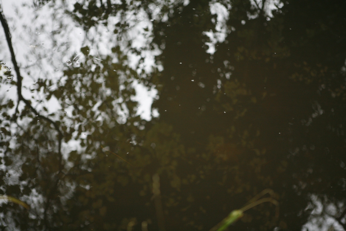
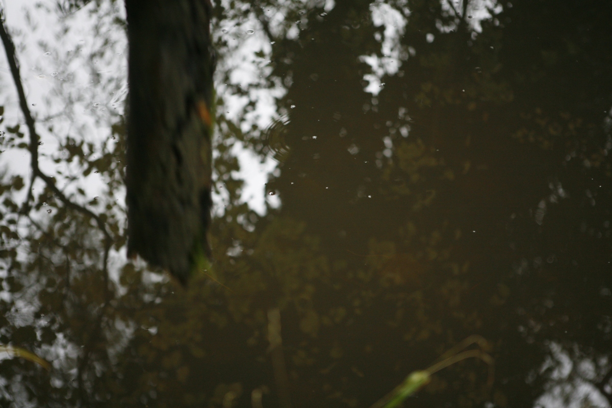
I wanted to see how things of different sizes and weights would hit the water and react. I used a fast shutter speed just like before with the photos of my Mum and myself doing movements and capturing them whilst they happen. I did this so that I could test if I could capture fast moving objects such as these logs, so once I’d found the perfect method I wanted to test if it would be fast enough to capture movement of water. So this is why I did these test shots. I went down to a ford which is in my village and threw in things like sticks, logs and stones. It was difficult to focus the camera on the water though but not on the reflections so I found a way to be able to do this. I threw leaves into the water and once they got to the centre of the shot I focused the camera on them. This meant that I got a perfect focus just above the water. Here are the pictures that I captured:

_mg_3873_mg_3874_mg_3875_mg_3876_mg_3877_mg_3878_mg_3879

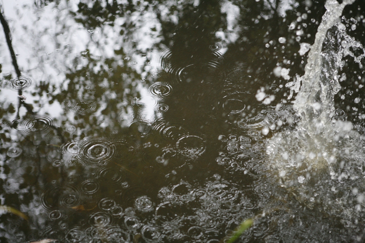
Firstly, here are a set of photos where two stones are being thrown into the water, one after another. I felt that the way the water reacts to the stones hitting it is really interesting and how it makes the water jump up once the stones make contact. I do feel though that this series of photos are hard to follow as it’s difficult to tell the difference between each stone being chucked in. I also think that the reflection does get in the way and so this is something to think about when taking my final photos so not to distract the eye with unneeded shadows.

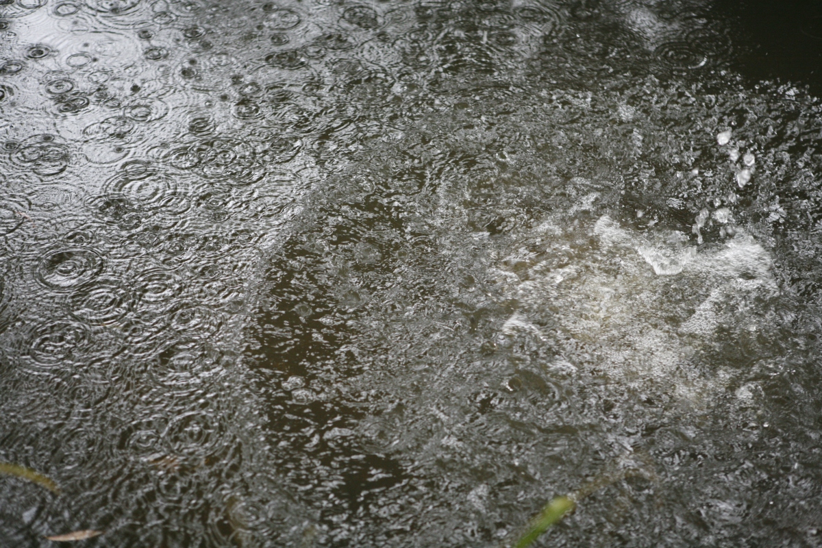
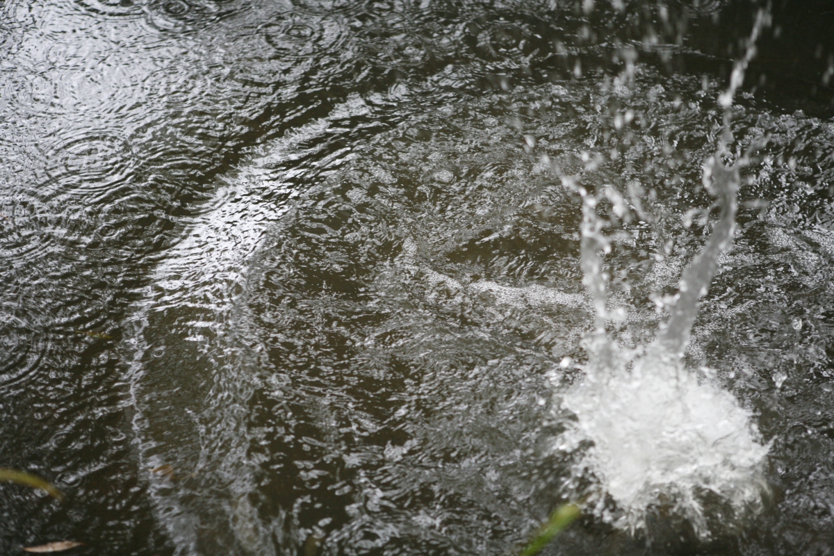
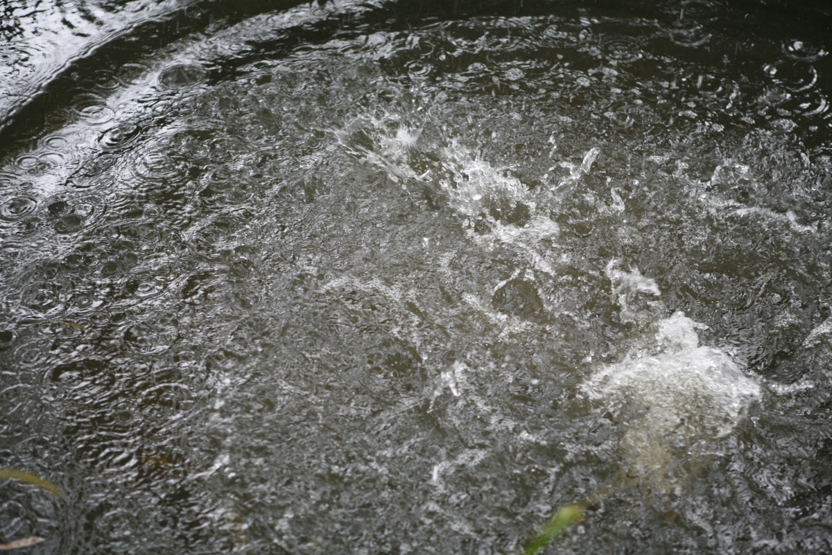
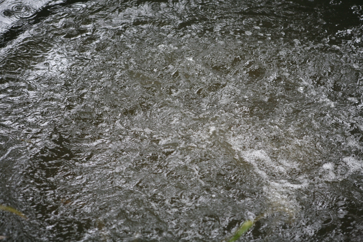
I also tried chucking different sized logs in as they are bigger and have a different shape giving it a larger surface area. I tried to make sure that the log came straight down when falling and wasn’t coming in at too much of an angle as I felt this would change the splashes dramatically. Here is one of the medium sized logs being chucked in:

_mg_3883_mg_3884_MG_3885.JPG_MG_3886.JPG_MG_3887.JPG_MG_3888.JPG_MG_3889.JPG_MG_3890.JPG
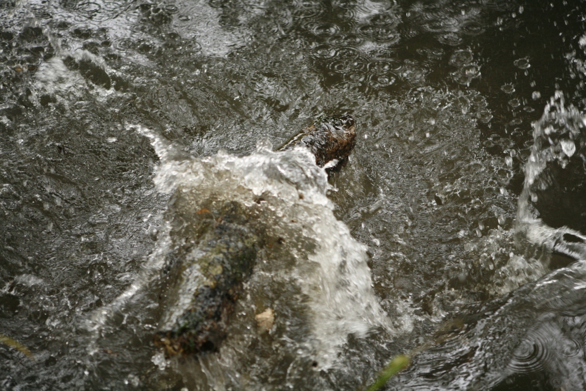
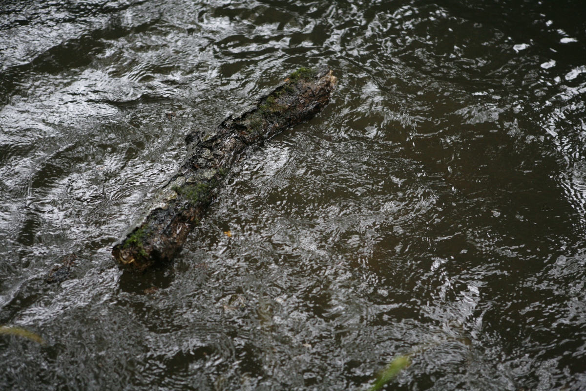
As you can see from these photos the log created a very different splash from the stones as the water went out from both sides creating a crater like shape just as if a meteor had hit the earth and left an indentation. The water for that split second has been cut apart by the log but straight after it’s already filled back in and is overlapping the log with the splashes of water which had been thrown into the air from the initial impact. This is more simple to follow due to only one thing being thrown in and it being large means it’s easier to follow.

Overall I feel that I found out a lot about the way that things hit water and I think I can understand how I would need to have my model fall for the water to react how I would like. I really feel that testing the shutter speed helped though so I knew that I needed it to be really light so that it could be clear and still. I also found that some of the splashes were a bit too fast to capture so this could possible mean that my model couldn’t fall in too fast as this might mean I don’t capture every part of the process. I do need around 12 photos so that I meet the correct amount for the brief and also the zoetrope needs at least 10 to make the story flow in the right way.

Portraiture

What is it?

Portraiture is anything from a painting to a photo where the face and the expression is visible. The photo is meant to tell you something about the person meaning it can’t be a snapshot but must be a photo of someone in a still pose. Normally the person is facing straight forward for more of the face to be visible.

The first portraits were paintings, as cameras weren’t created yet. Portraiture dates back to the Egyptians where they would paint a picture of someone for their funeral. This photo is of a Roman Egyptians Funeral portrait of a young boy.

Fayum02.jpg

How we are going to use it?

We are going to take photos of people and an object of them so that we can learn something about the person from the two photos. In the photos I wanted to experiment and not just take them with the person simply sitting in front of the camera.

Golden reflector W

Here is a simple portrait photo I took of Inga. This is the ordinary way of taking portrait photos as it shows the face well and there isn’t loads going on to distract you from the face. The lighting is important too as in the photo it makes her face brighter and more in focus.

College Documentary photos


Documentry Diptych

Here is my first diptych which shows equipment in the dark room and shoes against a window. I feel this lets you see the types of photography you could be doing and also that it’s a very happy and bright environment.

Documentry Diptych 2

Here is my second diptych which shows the photographers at work and people sat in the library. I feel this shows that it’s fun and you get to take lots of photographs also that there are many places to chill and read a book.

About the artists I looked at

Maria Slough:

article-2646054-1E6397D100000578-194_634x630.jpg

Slough’s photos are taken to tell stories and for them to have meanings. I feel this links to  my piece of work perfectly as this is the point of the photos I need to take. Her work is mostly with water which interests me due to my liking to water in my photos too. Her photos also have a surreal feeling to them which is the theme for most of my photos so I feel I could take some tips from her photographs.


Jacob Sutton:

70350-500w.jpg

Sutton’s work contains a lot of movement from clothes or the models half way through moving. This gives a really nice effect and this inspires me to have some movement in my photos to make them more lifelike and maybe to show distress. Also in some of his photos a girl is under water and there are air bubbles which I would like to capture in my photos as it makes it more real.


Lydia Lingenfeld:

a21319daa8e372079876e11c57da5e36.jpg

Lingenfeld isn’t a famous photographer and only has one of her photos on the internet but that does stop that photo being really inspiring. Looking at her photo you can tell a lot about the person and give them a story. Lingenfeld also includes water in her photos which gives me more possibilities for my photos.

My final Diptych’s

Here are my 3 final piece diptychs of people I know but who aren’t the same age as me or in my class. Here I’m going to be talking about why I chose these photos and what I think about the outcome. I will also be going through the different stages it took to get to these photos and how the ideas changed.

Stress drowning:

For this diptych I couldn’t decided between my night and day photos so in the end I decided in combing the two but after further research I figured that a quidriptych would look out of place in the exhibition due to the rest being diptychs. Due to this I changed my idea to have to separate diptychs printed instead so I could have both but still fit in with the other students work within the exhibition. I really feel that these photos have turned out how I’d wanted and that they’ve come a long way from them only going to be day photos and up close just of the face to them now being both day and night photos both far away enough to be able to see the hands and the edge of the acrylic too. I feel my idea changed a lot over time but I think it’s for the best and that they show anxiety really simply but helps you know what it would feel like. I’m mostly happy with the night one as it includes the red and dark side I was looking for.

Night diptychDay diptych


Heavy Balloons:

For this diptych I really wanted a surreal look with bright unnatural colours for a fairy tail look. In the photo my dad does have more emotion on his face then I wanted. I was looking for a completely poker face so that the viewer could choose what the meaning of the photo for themselves. Even though I changed the object photo from balloons to a pair of secateurs I still feels it gives the same message but tells the viewer more about my dad. I do feel that the photos have the bright colours I’d been looking for and that it gives the surreal and weirdness of him being in a suit whilst sat in water whilst surrounded by balloons. The photo has turned out how I wanted and I feel that the only thing I would want to be improved is the way the photo pops out at you and gives that wow reaction which I was looking at.

Diptych of dad


Happy Go Lucky:

For my final diptych I really wanted a fairy feel that you see when watching Disney or a theatre production. I used bluebells to create this as they are normally foun in woodlands and this is normally the home to mythical creatures. I really like movement in photos, so to capture the water being kicked was to make the photo feel more alive and as if it’s more than a photograph. I did have a problem with matching the blues of the flowers in both photographs but the way that the flowers in the object photo are so bright really makes it better and more like a fairytale. I am sad that the water idea didn’t work but sadly I didn’t have anything to back light it meaning the water wasn’t visible in the photos. I’m happy with how the photos came out though and how they changed to be better over time.

Happy go Lucky Diptych

Overal I feel that all the photos turned out to show exactly what I’d wanted and even include parts that I didn’t think about when first writing my ideas down. All the photos have deep meanings and all of which perfectly describe the person. Some of the photos changed a lot along the way but that’s a good thing and has been done due to test runs. If I could change any of the photos I would have liked to add more link to show that they all have water in them for a reason. The reason isn’t for me to explain though as it’s for people to get out of it what they want.

Diptych of Jorgie

Here is my first attempt of making a diptych with one of the photos being a portrait and the other being something that something about the photo in the other photo. I took the photos so that you can’t see the persons face but you get to know something about the person via the other photo.

I did this by taking a photo of Jorgie sat on the stairs near the front of college so that there was good lighting. I took her with her hands in between her legs which could show that she’s shy. I then took a photo of her hair with a camera strap over it which shows she likes camera and also that she’s a fun person as she has the ends of her hair green.

Jorgie Diptych.jpg

After taking these photos and creating this diptych I feel I have a better idea of what I want to do for my final piece photos and how I want them to be laid out. I now know that the object photography should always be the main thing in the shot so that you know what to look at straight away. I also know that the colours in both pictures should be similar so you can connect the photos easily together.


Final piece #3

Here are the third lot of photos for my final piece. I took them of my dad in the ford in my village. I took the photos with him wearing a suit whilst sat in the water with balloons surrounding him. I wanted him to look like nothing was happening but slightly sad. I took the photos with my Canon 5D and used a reflector to bounce the light back onto the balloons and the water. I got him to sit down in the water as it wasn’t deep enough for what I wanted, which is for the water to come up to his waist with him stood up. This meant I had to change my plan so the water would reach his waist still. This meant I had his legs out in front of him instead so it’s as if he’s given up as well. I got the balloons specially for this and got weights put on them so they would stay in the water. I also took the photos when it was raining which can be seen in the water giving a more sad feel to the photos. I got my inspiration for these photos from the photographer Jacob Sutton. I really liked his photos and how they were taken of odd and creative things. I wanted to follow this sort of style also, which gave me the inspiration to do these photos like I did.

Meaning of the photos:

The meaning of these photos was to show that my dad has so many problems holding him down which stops him from escaping his worries. The balloons and suit symbolise his hope and dreams and the water and the weights show that he can’t escape them and he’s being held back by them. The ripples of the rain in the water is like pathetic fallacy as he’s sad and rain is seen as a bad thing.

Portrait:

For the photos I got my dad to sit in the water and look like nothing was happening and it’s not meant to be literal, it’s meant to be what the feeling of having loads of worries feels like. I took many photos some portrait and some landscape. I made sure I included foliage in front of my dad too as this brought green into the whole photo sort of like a frame. I really like the reflections of the balloons in the water and that you can just see the blue of the weights in the water. I prefer the landscape photo more as it can fit the balloons in better and the colours are deeper and the capacity of the photos is higher than the landscape photo which included more of the background which isn’t necessary.

Heavy ballons 2Heavy Ballons 3

Object:

At first I wanted the object photo to be of balloons falling into the water to show that his problems are always getting worse. This was done by chucking the balloons into the water and taking the photo as they hit the water. I really liked how the photos turned out but after putting the object photo with the portrait I felt that having balloons in both photos was too much and didn’t look great.

Balloons object picture

So then I took a photo of some of my Dads secateurs which I’d hoped were red to go with the colour of the balloons but sadly they were green but I felt this linked in with the greenery in the background of the portrait photo. I took the photo of the secateurs in some grass so that the main colour in the photograph is green and so the silver on them stood out more. I took the photo at this angle to show how different you can make something look at a certain angle.

Object photo for dad

Diptych:

After taking all the photos and picking the ones I felt went the best together I made the final diptych. I edited them both in photoshop to make them similar in colours and sharpness. I feel they go really well together and compliment each other. These photos really explain who my dad is and what his life is. The combination really makes you realise that my dad has a lot of problems in his life which are holding him down from being better than he is now and that he is a gardener and loves the outside. If I was to change one thing I would have got some red secateurs instead so that the red would have been in both photos.

Diptych of dad.jpg

Final Piece #2

Here are the second lot of photos for my final piece. I took them of my mum in a woodland area down a quiet lane in the countryside. For these photos I started by using a bottle strapped to my mums back by her dress strap. The bottle had a bendy straw coming out of it which was connected to her ear using an elastic band. After I looked at the photos I noticed the water couldn’t be seen so after trying many things for it to be visible I decided to ditch the water idea. The photos were taken with my Canon 5D but the photos had to be edited after as the colours came out too dull from my camera. In the photos I wanted my mum to look floaty and fairy like so I put her in a long lose dress and put glitter all over her face but sadly none of it showed up in the photos. I got inspirations for these photos from Maria Lough’s photograph of a lady playing in a water fountain as she has a floaty look and she also looks surreal. I also really liked how vibrant her photos were which you can she coming out in my photos.

Meaning of the photos:

The meaning of these photos at first was about how my mum has a lot of information to remember for her job and sometimes she forgets things. I wanted her to look like a fairy because she’s always trying to please everyone but she can’t always remember what it is that people have said to her. The photo is trying to show what she would love to do which is get rid of unneeded information for the more important things. Once the water bottle idea had failed I changed the meaning to be that my mum is a happy go lucky person who can make anything a pleasant experience which is shown by how happy she is kicking water.

Portrait photos:

Water brain

The photo above is the photo using the water bottle to create water pouring from her ear. I took it on a hill of bluebells (Endymion non-scripta) in the sun for a fairy tale look. She has her arms out so she looks floaty and weightless. I used a reflector on the white side to light up the parts of her body which weren’t being hit by the sun. As you can see the water stream really its visible and it’s like this in all the photos. I like how the photo looks but sadly the water idea didn’t quiet work for me meaning I went on to try something different.


Happy go lucky 2

For this photo I sat my mum on a wall that was cover in bluebells and had a small trough under which was slightly clear. I positioned her to be crossed legged and to be admiring a flower and not showing her face. This shows her love of all things beautiful but also her shyness. This was taken in the shade so a reflector was used to make the light equal and brighter. The water represents that she could easily be in danger but she is safe on the wall supporting herself just like things she’s going through in life. I really like this photo and the position that she’s in as its very elegant and it’s very flattering. I still didn’t feel like it showed enough about her and that there wasn’t anything special about it.


Happy go lucky 1

Finally, the photo above is the last photo I took of my mum and the one I like the most as I feel it describes my mum well and it’s a very interesting and pretty photo. The colours are very vibrant and combined with the lighting makes the area seem very fairy-like and too good to be true. I let my mum do what she wanted without her knowing I was going to take photos still which meant I captured a true playful picture of her. Here I’ve captured her kicking the water around and smiling about it. I feel this explains my mum well as it shows that she still has dangers but she can make positives of them and overcome them. I want people to see that my mum is a happy go lucky person who can make a positive about anything.


Object:

Mums object

For the object about my mum I chose to take an un up close photo of a bluebell as this is my mums favourite flower due to when she was a child her granddad used to take her to the wood for walks and it was always this certain bluebell wood. This means that a bluebell has very fond memories for her and they are a happy thing for her.


Diptych:

Happy go Lucky Diptych

Here is the diptych I made from these photos. I feel that the photos go really well together due to the blue of the flowers in both of them being so similar. I really like the outcome of the photos together and I feel it describes the happy go lucky life of my mum really well whilst creating a simple but pretty diptych. If I was to change anything about it I would try and make the flower photo less eye catching then the photo of my mum so that all the focus is on her.


Final Piece Photos #1

Here are the first lot of photos for my final piece. I took them of my sister in our hot tub but sadly for her it had been off for winter meaning that it was freezing cold. For the photos we had an A3 sheet of acrylic instead of glass for safety reasons which was placed over her face whilst she was completely submerged under the hot tub’s water. The acrylic was to press her face against and to capture bubbles under. The photos were taken on my Canon 5D on manual focus as it wouldn’t focus quick enough when I was following her around the water. We first took the photos in day and used a reflector to bounce the light back onto her face and the acrylic but then we took some photos at night with the red light on in the hot and a light shining from next to the camera. At first my sister held the acrylic on her own but she couldn’t stop herself from moving around and floating so then we tried someone else holding it for her so she could hold herself still under the water, meaning she could push herself against the glass better too. I got my inspiration for these photos from a photo I found by Lydia Lingenfeld which is the same sort of thing with a girl against a piece of wet glass with her hands against it to give a feeling of being trapped. I took the idea of the glass against the face and to include water from Lingenfeld. I then put my own twist on it by making her completely underwater and also without her hands being on the glass.

Meaning of the photos:

The meaning of these photos is to show anxiety and the trapped feeling and how it makes you feel like you don’t have control which is like drowning. Anxiety is something that my sister suffers from meaning the photos hopefully explain how she feels. In the dark photos the acrylic is being held by someone else meaning it creates small details which if spotted are eerie as it means someone is holding her under the water and she doesn’t have control.

Day:

Stress Drowning 1Stress drowning 2

Here are two of the day photos which I feel worked well and explained the feeling of anxiety through photo form as I interpret it. These photos were taken using ambient light with the hot tub red light in the water behind for the look of blood and also to light the water. I used a reflector to get the sun rays onto the acrylic as the sun was in the wrong direction. The acrylic is being held by my sister meaning she couldn’t stay under the water long as she floated to the top quickly and moved around a lot. Taking the photos was difficult and my sister could only be under the water for a little amount of time as the water kept going up her nose. This meant that I only had small chances to take photos meaning that it was a long process. I really like how these two photographs above turned out as they show that she is holding the acrylic and her hair in the water has become very vibrant. I also like how the bubbles have been captured under the acrylic as it shows she releasing air. The landscape photo to me shows the anxiety she feels the most was its more focused and you can see more of her. The only thing I would change if I was going to is for the red light to show more and for her face to be against the glass more.

Night:

Stress Drowning 3 NStress Drowning 4 N

After taking the day photos I decided I’d try taking the photos at night instead and have someone else hold the acrylic for her so she could hold herself still and against the glass better. This meant that in the photos she is against the glass more and her hands aren’t in the photo, someone else’s are which is unsettling. As it was dark, the red light in the water became very strong becoming more like blood and filling the whole water. Due to it now being dark my sisters face stopped showing up so a light had to be brought down the garden to be held next to the camera. This wasn’t a strong light as we didn’t want the light to bounce off the acrylic too much and bleach the photos out. The photos came out blurry as my camera would only take the photos on slow shutter speed due to it being dark but i feel this makes the photos more real as it gives the feeling of movement and possibly that she’s struggling. The bubbles have showed up on her face very well and even cover her eyes giving her a fish looking eye. I really like these photos as they are more dark and sinister than the light ones and I also feel that they give a better feeling of how horrible anxiety is for people that suffer from it. If I could do these again I would try and capture a photograph where her eyes are open and looking at the camera.

Object Photo:

For the object to go with the portrait I decided I would use my sisters finger as they’re part of her and they say a lot about her. The first thing is that they’re wrinkly from the water meaning this links to the other photo and it also shows her finger prints which are a very important thing about a person as they’re even used for phone passwords now. I took some against a dark background and some against a white background so that if I picked either the light or the dark portrait photo this one would match it well. For the dark photo I took it so that the hand looks like its flopped over and could give the illusion of being dead. Also from the photos you can see that she’s got bitten nails which could be from being stressed and not knowing that she’s doing it.

Amelia's fingers.jpg

Amelia's fingers 2

I really like how they turned out and how only the fingers are in focus meaning that you only look at them. I also feel that the photos link well to the portraits and also tell the view something about my sister too. If I was to do them again I would make the photo more focused only on the finger tips and possibly take the photos in the water too so that they are in the same location as the portraits.

Diptychs:

Here are three different diptychs which I’ve created from the photos I took. I’ve tried putting light photos together and dark photos together but I did try putting opposites together as well.

Day diptych

The diptych above I feel works really well and also shows a light and clear view of what anxiety looks like. I feel the photos go feel together as they are both light and connected by the subject of water.

Day portrait diptych

For this diptych I put a light and dark photo together to see how it would look but I don’t like the outcome as I feel they don’t go together smoothly and the eye gets confused about which one to look at.

Night diptych

For the last diptych I put the dark photos together and I’m really pleased about how it turned out. I feel a more dark and gloomy theme to these and it definitely shows how bad anxiety can be. I feel that the movement in the photo below really goes well with the dead look of the hand above it.