Test shots

After looking at photos and people’s work that inspires me I decided that I would go and try to take photos in ways similar and to see if it was something I felt would work for what I am looking for. I went through the photos/art that I had been inspired by and let them inspire me and change my idea to be like theirs. I didn’t do one for each person as some of them are very similar so some of my test shots cover more than one artists work.

Here are my test shots:

1. Here is my first photo which I made with inspiration from Max Riché, Eadweard Muybridge and Harold Eugene Edgerton. I did this by setting my camera (Canon 5D) onto a tripod and setting up looking at an area which enabled me to have enough space to do a cartwheel. I put the camera onto TV mode and at 1000 which means that I could capture fast movements without them being blurred. I then also set the camera up so that it would take lots of photos in one go. I first took a photo with out me in it. I then got into position and got someone to count down and then hold the button firm down until I had finished doing the cartwheel. After that I opened all the photos onto photoshop and used the eraser tool to go around myself in each photo and then place them all onto the first photo which I’m not in. Once I’d placed all of the different movements onto the background photo I started moving them around so that the individual photos could be seen better. Even though this made it unrealistic I found that it didn’t look too different and it made it easier to see each movement. I think it worked really well but I do think that a longer movement would have worked better. Also someone who could do a fluid movement in an elegant way would look better than my awful cartwheel which is clunky and overlaps a bit too much. I feel that this way of placing photos together so you can see all the individual movements could look really affective with the idea of the boy falling into water.

cartwheel-movement

2. For my second test I took inspiration from Elliot Schultz as he creates movement by making individual images and then playing them fast one after another. I decided to try and make a stop motion with Lego and try and make it detailed and capture lots of realistic movements. I also tried to not make it too long so that it didn’t go on for ages as this would have taken a lot more photos than I already took to create. I used a tripod and placed some cardboard on the floor to make a smooth and plain setting. I then got lighting and directed it towards the cardboard area so that it wasn’t too dark and so the details and small actions could be seen. I then started to move the lego in from the side and took photos one at a time and moving the Lego in little by little. I then continued the movement by getting the guy out and then the dog. This took around half an hour to set up and shoot the photos. I then placed the pictures together on iMovie and made the photos stay on for a split second each so that it was a smooth transition and so it ran smoothly. I think it went well and the outcome looks effective and just like it actually happened without me moving them by hand but I don’t think that stop motion would work for my idea. I think that other methods would work better to capture someone falling and to be able to play the individual movements smoothly.

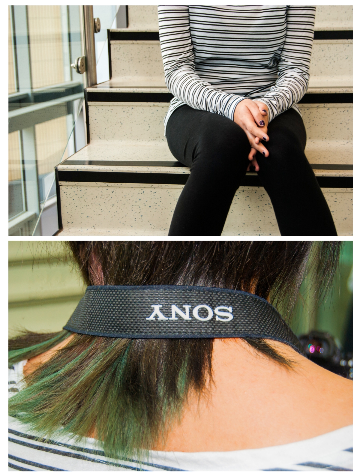
3. Then for my last three test photos I got inspiration from Martin Waugh, Pedro Covo and Dorothea Lange’s work. I wanted to capture a movement that is really fast and make it clear and as if it isn’t moving just like Martin Waugh’s water photos where they are splashing but they look like they are still and made of something solid. I also wanted to capture something like Pedro Covo’s work where he paints people splashing into water. His paintings make it possible to capture that single movement as a still and something you can keep looking at. I then lastly wanted it to look to Dorothea Lange’s work as she makes her photos capture emotion and that was something I wanted my photos to capture too. I took my photos all the same way which I did by setting my camera onto TV mode and at 1000 which means that I could capture fast movements without them being blurred. I then got my mum to do lots of fast movements such as flicking her hair around and jumping on the bed. I then got her to take a photo of me flicking my hair around as my hair is longer and I wanted to see how it would look. For the photo of her jumping on the bed I got her to look like she was actually doing a handstand on the ceiling as I knew that it would look bazar when captured as a still photo. Then for her hair one I wanted to capture her smiling and being happy and with her hair going up in the air. I felt that this photo captures emotion perfectly and looks really interesting with her hair. Then for the photo of me I found that my hair looked really amazing and went everywhere which looks like I’ve been caught in a strong wind. I think this method of capturing movement is really affective and I want to try and capture someone jumping into water with this method.


hair-flickhappy-mummum-jumping

Overall I found that the photos made me really sure that what I wanted to do was possible and that if I took my photos for the final piece that I would be able to capture all the intricate poses that happen when someone falls and hits water and how the body reacts to falling. I feel that I’ve found out lots about how I can stop movement whilst it’s happening and it not be blurred which is a massive step in the right direction for my idea. I don’t know what I would have done if all my photos were blurry. The only thing is that I’ll need to test this with things falling into water so I can see the impact that happens.


Final Photos on location:

After changing my ideas and testing what I wanted my final pieces to look like I took my final photos. Here are the ones I took on location in my shower at home.

I firstly turned my shower on to hot and shut all the windows and the door to the room so that the room would become foggy and so that the shower door would become wet and misty. I then put red lipstick on my model and turned the shower off. Then I got my model to get into the shower and to stand up close to the door. I then took photos from the other side so I could capture the foggy window in front of my models face. Then when I’d captured a good amount of photos with it like that I rubbed out part of the fogginess on the window so that there was a gap that could be seen through better. Then I took more photos but including the gap that I’d just made. I tried to just have the lips and the nose through the gap as it means that you can’t fully identify the person which creates a sense of the unknown.

Here are some photos of me setting the bathroom up:

IMG_4488.JPG

IMG_4487.JPG

I her to wear a pretty brown dress that was low cut so that the shape of her body could be made out behind the fog making it easier to see that it’s a girl and they are wearing a dress. I also styled her hair so that it was straight and pointed at the edges. I did this so that her hair is noticeable and also catches peoples eyes and makes them want to have their hair like that. There are patterns on the door of my shower which are captured in the photos but I think this makes the photos more bizarre.

Here are the four photos I chose and edited:mum-in-shower

mum-in-shower-2mum-in-shower-3mum-in-shower-4

The top photo is my favourite as the angle is really flattering and the whip through the glass really make the photo become unusual. I also like that the hair in the photo is being caught by the sun which makes it have a nice pop of colour. I feel the top two photos with the whips out worked the best whilst the bottom two photos look good but aren’t as easy to know that they are of someone in the shower as the foggy glass looks weird. I think these photos are bold and fashionable as they catch your eye easily due to the scenery and the pop of red coming from the lipstick. The lipstick is also the thing that could makes it fashionable alongside the hair which is also a main feature of the picture. To make sure that it  wasn’t just me that liked the photo, I went out and asked people within the age brackets what they thought of the photos and they all were very positive.

Here are are the comments people said about my photos:

“I really like how unique your image is and it’s defiantly eye catching. I think using the bright lipstick worked really well and I like how it’s brought to your attention by the wiped clean bit of glass”

“I love the idea behind the theme of the image. Very creative, also love the colours used in the image”

“Unique idea but works really well, I think you captured your ideas perfectly”

“I like how you used something in your everyday life to make a unique photo”


Final photos in the studio

After changing my ideas and testing what I wanted my final pieces to look like I took my final photos. Here are the ones I took in the light studio but ended up changing to the dark studio so that I could get a stormy look and be able to control the lighting in the photos.

I firstly started by making thunder storms on A3 pieces of card and then cutting them out and connecting them to string. I then once they were connected to the string put them onto a bamboo stick using tape and made sure they were all spaced out and at different heights. I then connected the bamboo stick to a camera pole that was in the studio using tape and positioned it over the set where I was taking my photos. Then to create a cloud I bought 5 bags of teddy bear stuffing and spread out on the studio floor under the clouds that were hanging. I then used yellow face paint to paint my model so that it looked like he’d been shaded.

Here are some photos of me setting the studio up:


I got him to wear fashionable clothing and to look like something that someone would inspire to be like. I wanted the feeling of the photo to be as if it was taken in the clouds and that my model is asleep up there and meanwhile there is a thunderstorm happening above. This is why he has yellow on his body so that it looks like the yellow from the lightning has caused reflections of yellow onto his skin.

Here are the four photos I chose and edited:

close-up-of-cloud-photofar-away-photo-of-cloudsstraight-ahead-clouds-up

straight-forward-clouds

I feel the top two photos are my strongest out of the four I have taken for my final piece as they are from a flattering side angel. I also like the placement of the clouds over him as they bring your eyes down but don’t take full concentration away from the model. I do like the bottom two as well though as they show a different perspective of the cloud world I created and could tell a different story to views. I like the clouds in the last photo as they are placed differently compared to the other photos which shows that I’m experimenting and not just sticking to the same plan. I took them all in portrait as a magazine would need them to fit on the front cover. I feel that they worked really well and when I went out and tested it by talking to people within the age specification about what they thought about the photos, I got positive feedback.

Here are some of the things people said about these photos:
“the cloud images are very imaginative and you have shot them very effectively”

“I like the clouds as it’s a unique idea especially with the face paint”

“The cloud ones are cool and well thought out – tells a story behind the images”

“I like the fluffy cloud photos, incredibly unique”

Improving my Final ideas

After trying my first ideas out and thinking about if it would work for the front cover of a magazine, I came up with improved ideas and ones that I felt could be front page quality.

1)

For my first idea I wanted to create a photo in a studio with someone lying down and have them surrounded by things. Well that idea has changed quiet a bit but the basics are the same. Instead of patterns and the person being on a silk blanket, they’d be lying on a cloud of teddy bear stuffing and have massive drawings of thunder storms hanging over them from the ceiling. The person would be wearing fashionable clothing and would probably be a boy so that it could interest girls and boys. I want to make it like a drawing so that’s why the storm clouds are drawings. Also the boy would be shaded with yellow to match the lightning colour and give it the drawing feel. Here is a drawing to show my idea:

IMG_4459.JPG

This is a rough sketch of my idea and I will be shooting the actual Final piece of it soon. I really think this would make a perfect and new idea for a front cover of a magazine. It would easily make people pick it up and it could make people want to feel as awesome as the photo.


2)

For my second idea it hasn’t changed much from last time but now I’ve changed it to being in a shower or somewhere weird. This would be my location portrait and I would use a girl to make it something both a girl and boy would be interested in. I would want the person to wear clothes and makeup to still show the fashion side of it and so it’s really weird. Here is the photo I took:

Mum with foggy glass.jpg

I took this without lighting or setting up properly as I just wanted to see if it would look how I expected and that you could still see the face enough. The only thing that I don’t think worked is that there’s no proper lighting making the photo very dark and grungy. When I take my actually final piece for this I think I’ll use bright lights and do noticeable makeup with a fashionable outfit.

Assignment 1 & 2 research

For this assignment we have to take portrait photos in a studio and on location. They both need to be for the front cover of a magazine for people between the age of 16 to 24 to make them feel inspired and want to look like that. The photos have to be different to what is already out there and has been done before. To start we need to research what people have already done and so that we can make ours different. We also need to find inspiration for our photos.

What is already out there:

The three photos above show the simple poses for women where they just look pretty and are side on to the camera so that they can make the model look more elegant. This is normal and basic so it’s something that need to stay away from doing.

The five photos above are more adventurous and not something that you would normally find. They are bizarre and not something you would feel inspired by so it’s still not something that I want to copy for my photos.

Inspiration for my photos:

I really like the idea of working with steam and water to give an unusual look to the photos so that they aren’t easy to understand at first. The photos above are really interesting and give a weird look to the person. They are taken by David Ryle in a serious of photos called Trifecta.

This photo above is another example where the photo is made interesting due to a layer being in the way making it easier to manipulate the photo with it.

Here is a drawing of eyes with the makeup and paint running down. I feel this could be interesting to make the face have imperfections like makeup.

The photo above is of the Rolling Stones by David Bailey and it’s interesting due to the material that is on their face and being blown around. You can still see their faces still which means that it’s still something that could be used on a magazine.

I really like the makeup in the photo above and how it is all similar colours and the flowers make the photos pop with colour and make it interesting.

I like the background idea for this photo above as its pretty and simple. Could be something to think about.

I’m really interesting in this one for my studio photo as it’s really different and not something that is normally on the front cover of a magazine. I like the blanket in the background and how they are lying down and not all of them are showing as they are sort of writhing around.

College Documentary photos


Documentry Diptych

Here is my first diptych which shows equipment in the dark room and shoes against a window. I feel this lets you see the types of photography you could be doing and also that it’s a very happy and bright environment.

Documentry Diptych 2

Here is my second diptych which shows the photographers at work and people sat in the library. I feel this shows that it’s fun and you get to take lots of photographs also that there are many places to chill and read a book.

About the artists I looked at

Maria Slough:

article-2646054-1E6397D100000578-194_634x630.jpg

Slough’s photos are taken to tell stories and for them to have meanings. I feel this links to  my piece of work perfectly as this is the point of the photos I need to take. Her work is mostly with water which interests me due to my liking to water in my photos too. Her photos also have a surreal feeling to them which is the theme for most of my photos so I feel I could take some tips from her photographs.


Jacob Sutton:

70350-500w.jpg

Sutton’s work contains a lot of movement from clothes or the models half way through moving. This gives a really nice effect and this inspires me to have some movement in my photos to make them more lifelike and maybe to show distress. Also in some of his photos a girl is under water and there are air bubbles which I would like to capture in my photos as it makes it more real.


Lydia Lingenfeld:

a21319daa8e372079876e11c57da5e36.jpg

Lingenfeld isn’t a famous photographer and only has one of her photos on the internet but that does stop that photo being really inspiring. Looking at her photo you can tell a lot about the person and give them a story. Lingenfeld also includes water in her photos which gives me more possibilities for my photos.

My final Diptych’s

Here are my 3 final piece diptychs of people I know but who aren’t the same age as me or in my class. Here I’m going to be talking about why I chose these photos and what I think about the outcome. I will also be going through the different stages it took to get to these photos and how the ideas changed.

Stress drowning:

For this diptych I couldn’t decided between my night and day photos so in the end I decided in combing the two but after further research I figured that a quidriptych would look out of place in the exhibition due to the rest being diptychs. Due to this I changed my idea to have to separate diptychs printed instead so I could have both but still fit in with the other students work within the exhibition. I really feel that these photos have turned out how I’d wanted and that they’ve come a long way from them only going to be day photos and up close just of the face to them now being both day and night photos both far away enough to be able to see the hands and the edge of the acrylic too. I feel my idea changed a lot over time but I think it’s for the best and that they show anxiety really simply but helps you know what it would feel like. I’m mostly happy with the night one as it includes the red and dark side I was looking for.

Night diptychDay diptych


Heavy Balloons:

For this diptych I really wanted a surreal look with bright unnatural colours for a fairy tail look. In the photo my dad does have more emotion on his face then I wanted. I was looking for a completely poker face so that the viewer could choose what the meaning of the photo for themselves. Even though I changed the object photo from balloons to a pair of secateurs I still feels it gives the same message but tells the viewer more about my dad. I do feel that the photos have the bright colours I’d been looking for and that it gives the surreal and weirdness of him being in a suit whilst sat in water whilst surrounded by balloons. The photo has turned out how I wanted and I feel that the only thing I would want to be improved is the way the photo pops out at you and gives that wow reaction which I was looking at.

Diptych of dad


Happy Go Lucky:

For my final diptych I really wanted a fairy feel that you see when watching Disney or a theatre production. I used bluebells to create this as they are normally foun in woodlands and this is normally the home to mythical creatures. I really like movement in photos, so to capture the water being kicked was to make the photo feel more alive and as if it’s more than a photograph. I did have a problem with matching the blues of the flowers in both photographs but the way that the flowers in the object photo are so bright really makes it better and more like a fairytale. I am sad that the water idea didn’t work but sadly I didn’t have anything to back light it meaning the water wasn’t visible in the photos. I’m happy with how the photos came out though and how they changed to be better over time.

Happy go Lucky Diptych

Overal I feel that all the photos turned out to show exactly what I’d wanted and even include parts that I didn’t think about when first writing my ideas down. All the photos have deep meanings and all of which perfectly describe the person. Some of the photos changed a lot along the way but that’s a good thing and has been done due to test runs. If I could change any of the photos I would have liked to add more link to show that they all have water in them for a reason. The reason isn’t for me to explain though as it’s for people to get out of it what they want.

Diptych of Jorgie

Here is my first attempt of making a diptych with one of the photos being a portrait and the other being something that something about the photo in the other photo. I took the photos so that you can’t see the persons face but you get to know something about the person via the other photo.

I did this by taking a photo of Jorgie sat on the stairs near the front of college so that there was good lighting. I took her with her hands in between her legs which could show that she’s shy. I then took a photo of her hair with a camera strap over it which shows she likes camera and also that she’s a fun person as she has the ends of her hair green.

Jorgie Diptych.jpg

After taking these photos and creating this diptych I feel I have a better idea of what I want to do for my final piece photos and how I want them to be laid out. I now know that the object photography should always be the main thing in the shot so that you know what to look at straight away. I also know that the colours in both pictures should be similar so you can connect the photos easily together.